My cousin switched from an iPhone 14 to a Samsung Galaxy last spring, and for two weeks straight she texted me the same complaint: “It just doesn’t feel like my phone.” Not because Android is worse. It’s just… different. Different icons, different gestures, different everything.
That’s what got me curious about installing an iPhone Launcher App for Android myself. I wanted to know if these apps actually deliver an iOS-style experience, or if they’re just a wallpaper trick dressed up with a fancy name. So I picked one up from the Play Store, set it as my default launcher, and lived with it for a full month on my daily driver — a Pixel phone I use for work.
Here’s everything I found, mistakes included.
What an iPhone Launcher App for Android Actually Is
Before I get into my experience, let’s clear something up, because I got this wrong at first too.
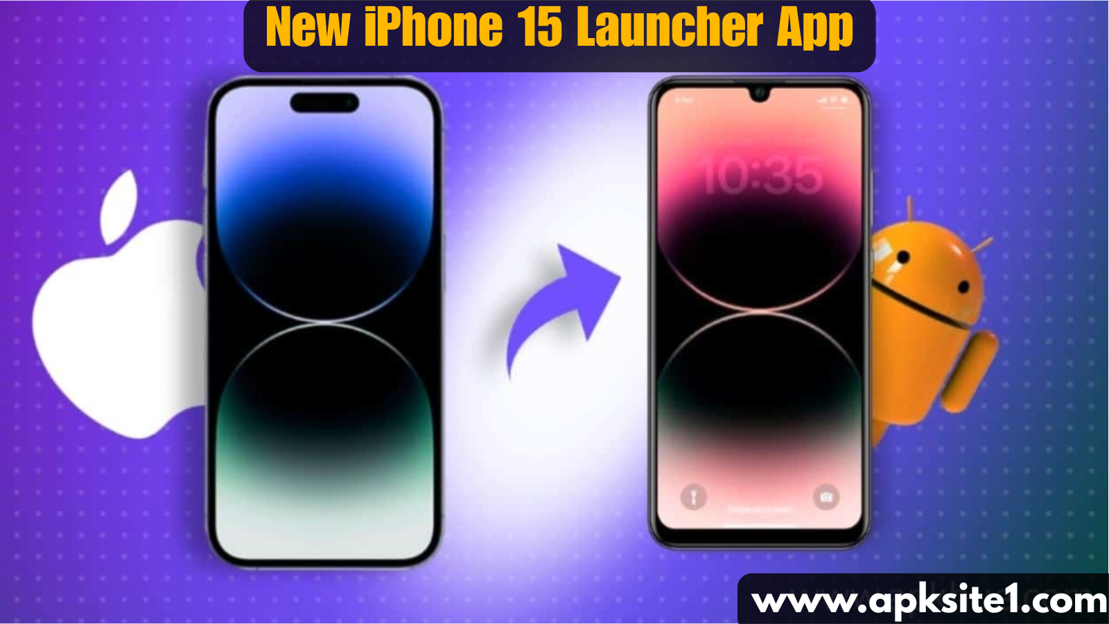
An iPhone Launcher App for Android is not an Apple product, and it’s not officially connected to Apple in any way. It’s a third-party app — usually built by an independent developer team — that changes how your Android home screen looks and behaves so it resembles iOS. Think of it as a skin, not a transplant.
Under the hood, your phone is still 100% Android. You’re still running Android’s file system, still using the Google Play Store, still getting Android updates. The launcher just repaints the surface.
I mention this upfront because a few reviews online make it sound like you’re getting “an iPhone experience” in the literal sense, and that’s misleading. You’re getting an iOS-styled home screen, not iOS software.
Setting It Up: What I Did (and What I’d Do Differently)
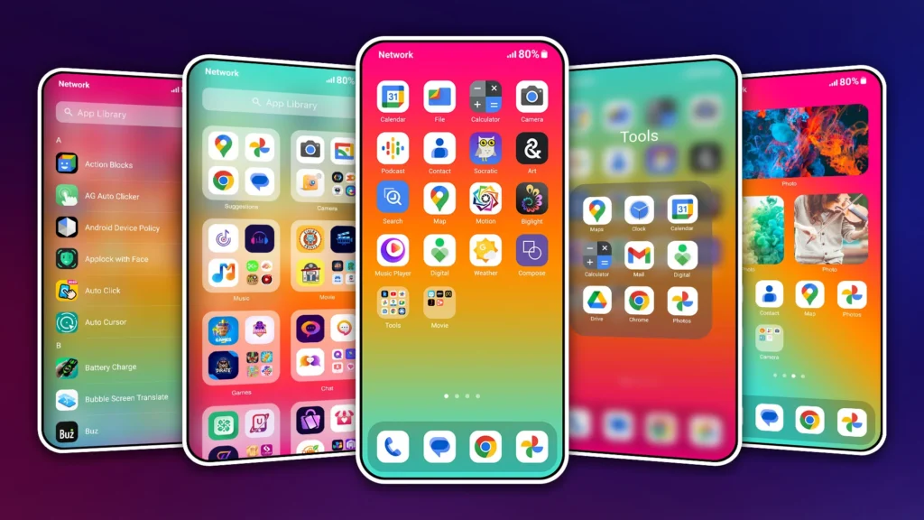
I downloaded the launcher from the Play Store, granted the permissions it asked for, and set it as my default home app. Within about five minutes I had:
- An iOS-style dock at the bottom with four fixed app icons
- Rounded-square icon shapes replacing my usual Android grid
- A swipe-down “Control Center” panel with quick toggles for Wi-Fi, Bluetooth, and flashlight
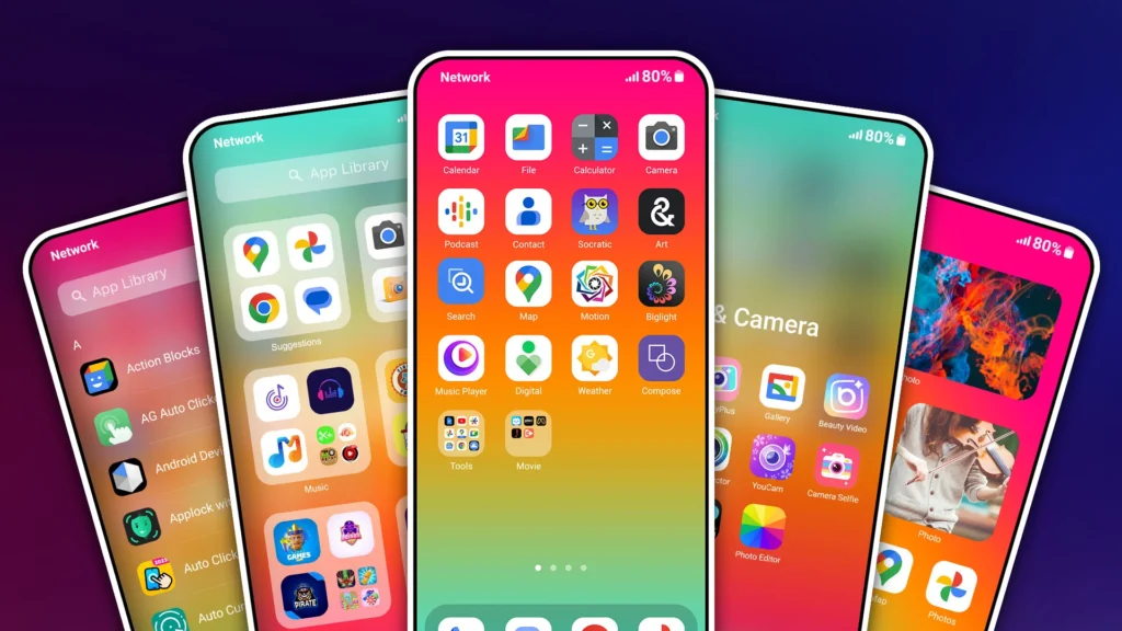
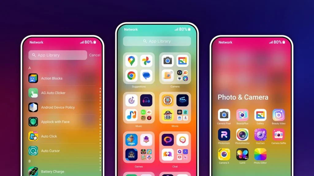
- An app drawer that mimics Apple’s App Library, grouping apps automatically by category
My first mistake: I didn’t back up my original home screen layout before switching. When I eventually wanted to compare the two experiences side by side, I had to manually rebuild my old app folders from scratch. If you’re trying one of these launchers, save yourself the hassle — screenshot your current layout first.
What Actually Worked Well
The App Library-style grouping was genuinely useful. I have a cluttered home screen habit — dozens of apps I never organize. Having them auto-sorted into folders like “Social,” “Utilities,” and “Productivity” made my phone feel less chaotic almost immediately.
Icon customization was deep. I could reshape icons, add subtle shadows, and pick from a handful of iOS-style icon packs. For anyone who just wants that clean, minimal look, this is the strongest selling point.
Widgets worked better than I expected. I added a weather widget and a calendar widget to my home screen, and they resized and behaved reasonably close to how iOS widgets look — rounded corners, translucent backgrounds, the whole aesthetic.
Where It Fell Short (Be Honest With Yourself Here)
The “Control Center” is cosmetic, not functional-identical. It looks like Apple’s Control Center, but a few toggles — like the cellular data shortcut — didn’t map cleanly to Android’s settings and just opened a settings menu instead of toggling instantly.
Siri integration is not real Siri. This is the part I want to be very clear about, because I’ve seen other sites claim these launchers let you “use Siri on Android.” That’s not accurate. What you actually get is a shortcut icon that either opens Google Assistant with an Apple-style animation, or does nothing more than mimic the visual pop-up. Apple’s Siri only runs on Apple hardware and software — there’s no legitimate way to run actual Siri on an Android phone. If a launcher app claims otherwise, that’s a red flag worth being skeptical of.
Battery drain was noticeable. Over my first week, I saw about 8-10% more battery usage per day compared to my stock launcher, likely from the extra animations and background processes needed to mimic iOS transitions.
Some system gestures conflicted. Android’s own back-gesture and the launcher’s swipe-up-for-app-library gesture occasionally fought each other, especially in full-screen apps like games.
Step-by-Step: How to Try One Without Wrecking Your Setup
If you want to test this out yourself, here’s the process I’d recommend based on what I learned the hard way:
- Screenshot your current home screens before changing anything, so you can rebuild your layout if you switch back.
- Check reviews and permissions carefully in the Play Store listing before installing — avoid anything asking for permissions unrelated to a launcher (like SMS access).
- Install and set it as your default launcher through your phone’s Settings > Apps > Default Apps menu.
- Spend a few days customizing icon packs and widgets rather than judging it on day one — most of these apps need setup time to feel right.
- Test your daily-use apps (banking, maps, work apps) to make sure gestures and shortcuts still behave normally.
- Keep your original launcher installed so switching back is a two-tap process, not a factory reset.
Real Use Cases Where This Actually Makes Sense
- You’re used to iOS and just switched phones. The muscle memory transition is genuinely easier with a familiar layout.
- You’re a content creator or reviewer who needs to demo an iOS-style interface without owning an iPhone.
- You just like the aesthetic. Some people prefer Apple’s visual minimalism regardless of which operating system they’re on, and that’s a completely valid reason.
Where it makes less sense: if you rely heavily on Android-specific features like deep widget customization, multiple launcher gestures, or heavy multitasking — the iOS-style constraints can start to feel limiting rather than helpful.
Common Mistakes to Avoid
- Assuming it replaces Apple’s ecosystem. No launcher gives you iMessage, real Siri, AirDrop, or Apple’s actual software — it changes appearance only.
- Skipping the permissions check. Some clone-style launcher apps request more access than they need. Stick to well-reviewed apps with a transparent developer history.
- Not testing battery impact before committing. Give it a few days and check your battery stats before deciding it’s a keeper.
- Forgetting to back up your layout. I learned this one the annoying way.
Final Thoughts
After a month of daily use, my take is pretty simple: an iPhone Launcher App for Android is a fun, legitimate way to reshape how your phone looks and feels — but it’s a cosmetic layer, not a functional clone of iOS. If you go in expecting a skin with some genuinely useful organizational tools, you’ll probably enjoy it, like I did. If you go in expecting actual Apple software features like Siri or iMessage, you’ll be disappointed.
For me, I ended up keeping the App Library-style folder grouping long after I switched back to my regular launcher, because that part alone made my home screen easier to live with. The rest was fun to try, but not something I stuck with permanently.
If you’re switching between ecosystems or just curious what the fuss is about, it’s worth a free download and a weekend of testing. Just go in with realistic expectations, and you’ll get a lot more out of it.
For more information, visit: APKSITE1